Paul Crimi Product Design
Paul Crimi Product Design

Building a modular platform and aligning 50+ dealerships — and integrating it into a massive digital experience. Tried, user-tested, and true.
Product Management | Product Strategy | User Experience Design (UX) | User Testing
A 48-Hour Whirlwind
Who hasn’t heard of Audi? The esteemed brand was born in Ingolstadt, Germany in 1932, and is now one of the largest automobile manufacturers in the world. Audi is an undeniable powerhouse - they design, engineer, produce, market, and distribute luxury vehicles in nine production facilities across the globe.
My friends at BIMM have been working for Audi for years. In search of feedback, their team shared their upcoming product strategy for Audi. “What would you do?” I recall being asked. As ideas were shared, the snowball began to grow bigger. Within two days, I was standing in their boardroom in front of the Audi team, ready to pitch to one of the biggest luxury car brands in the world.
The prospect of challenge feels the way coffee tastes; it wakes you up, it sharpens your focus, and most of all, it makes you crave more. There are moments in life when you know you’re about to be a part of something big. This is exactly the experience from the moment I began working with Audi.
If closing the pitch was the qualifying lap, to start the race we needed to shift into high gear. Pun intended.
Revving the Engine
Historically, Audi dealerships across Canada maintain their own websites. Every site looked and felt different, was disjointed, didn’t make for an ideal customer journey, and it was hurting the Audi brand
Aligning 50 retailers to the same design and process is no small task. The automotive industry is unique - there’s a sense of history, of legacy even, with every effort put forth. As such, a solution was needed for Audi that went the distance without alienating the brand’s roots and loyal customer base. Furthermore, producing results that aligned with the notable standard Audi has long championed was critical for the success of this project.
As with every project, product planning is in the pole position.
Building the Foundation
Product planning exists for a critical reason: it set the tone and cadence of a project while creating appropriate timelines to work in accordance to. Organization is key with any project let alone a project of this magnitude.
Working with both BIMM and Audi, a unique agile process was crafted, identifying relevant phases and who would be working within each phase. Knowing that to successfully manage the communications between three teams would require deliberate planning; fully integrating with their scrum team and communication was daily via Slack. Sprint reviews and sprint planning frequently occurred on site. Ultimately, the management of the project would be paramount to its successful delivery.
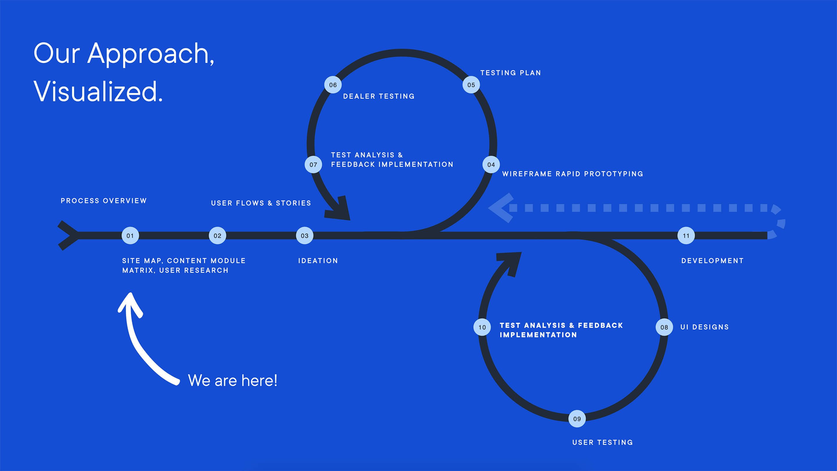
To align 50 dealerships to one design and process. Part of the discovery phase was gathering all requirements from each dealer. The same then happened for the Audi team’s requirements. Lastly, our customer personas were defined and their needs uncovered and planned for. The information gathered was distilled into epics and their various expansions for future phases (V1, V2, V3, etc.). Taking the epics and mapping them out across our sprint cycles and various phases illustrated a clear path to launch.
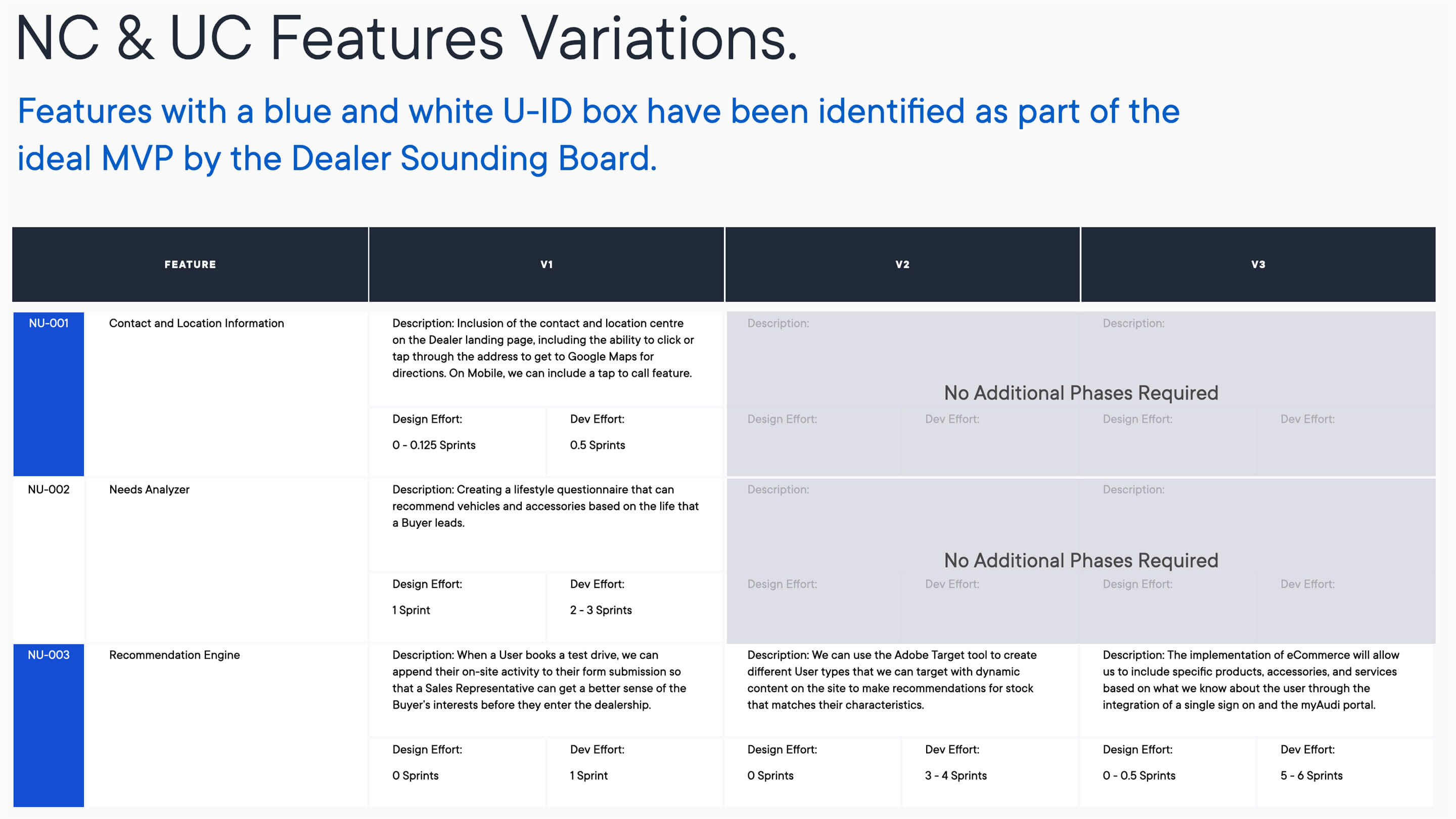
Armed with a plan, it was time to start the user experience design cycle.
(UX) Designed, Sealed, Delivered
Strategy set the stage for the killer UX designs that would soon follow.
Initially, one of the biggest challenges encountered was working around base infrastructure - every dealership was different. Creating a flexible experience was vital to ensure every feature and user flow played together nicely - while allowing for specific customization. What was developed was an experience that felt new, yet still maintained the integrity of the original design language from the design team in Germany.
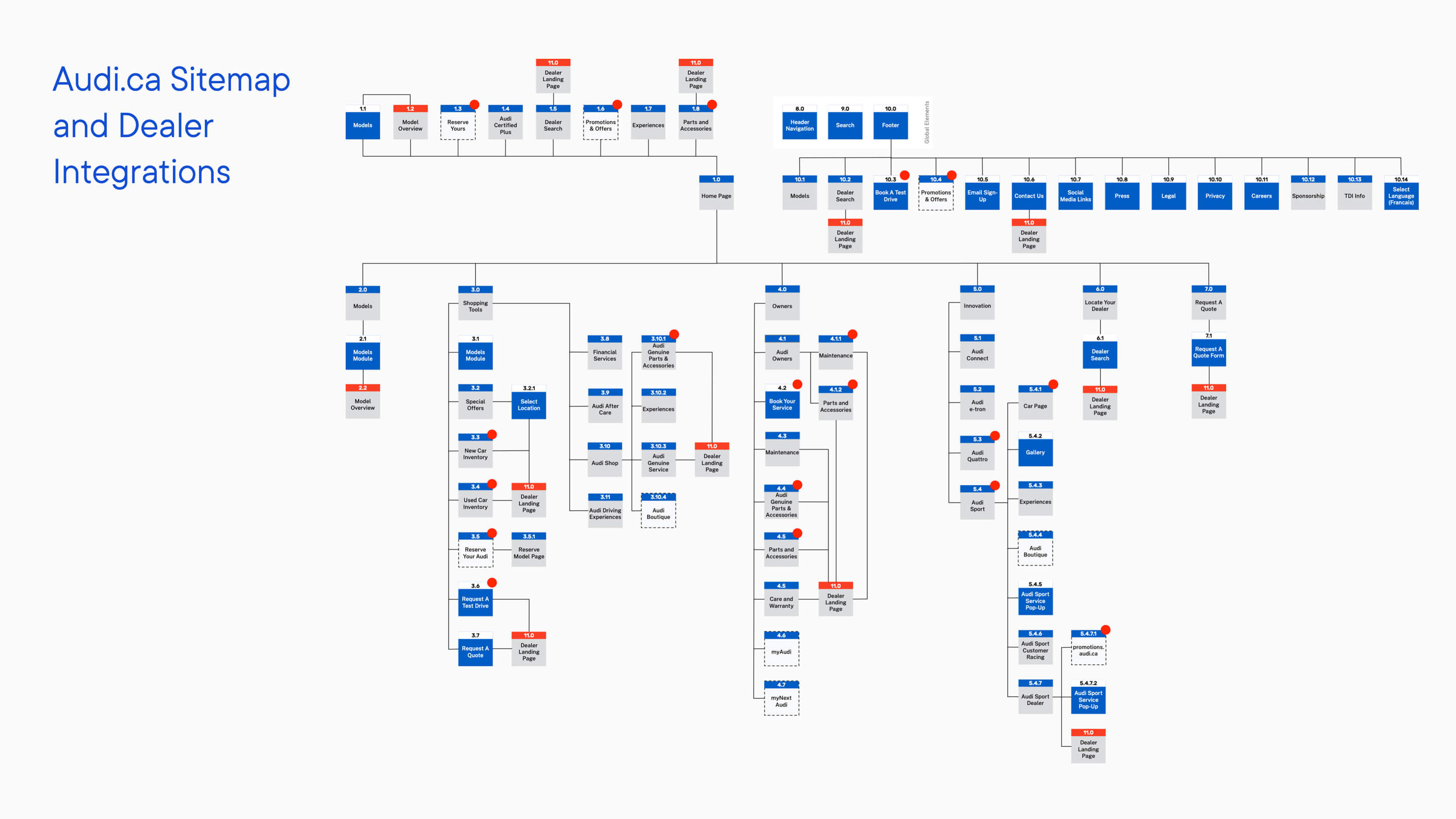
It began with landing pages. A sitemap of the entire audi.ca was first created to ensure that every integration possibility was accounted for and as seamless as possible. The objective was to showcase where the dealer landing pages lived within the ecosystem and to outline the integration of future functionality to highlight their touchpoints within the ideal state of the site. This helped create the MVP - the minimum viable product. An important stage in the development of UX, the site map allowed us to plan and communicate our plan of attack.
From there, user flows were created, crafted specifically to outline the interaction a user experiences within our intended ecosystem. From entry points to lead generations to conversions, it was all mapped out.
A huge part of the process involved thinking not only like the consumer but like a dealer. It wasn’t just about appealing to those who were buying cars - the sites also had to appeal to those who are selling cars. This intention influenced the work throughout the entire process.
Because the strategy was finalized, we arranged numerous workshops to further define our plan and Audi’s desired result. If strategy outlines the shape of the project, research begins to colour in the lines.
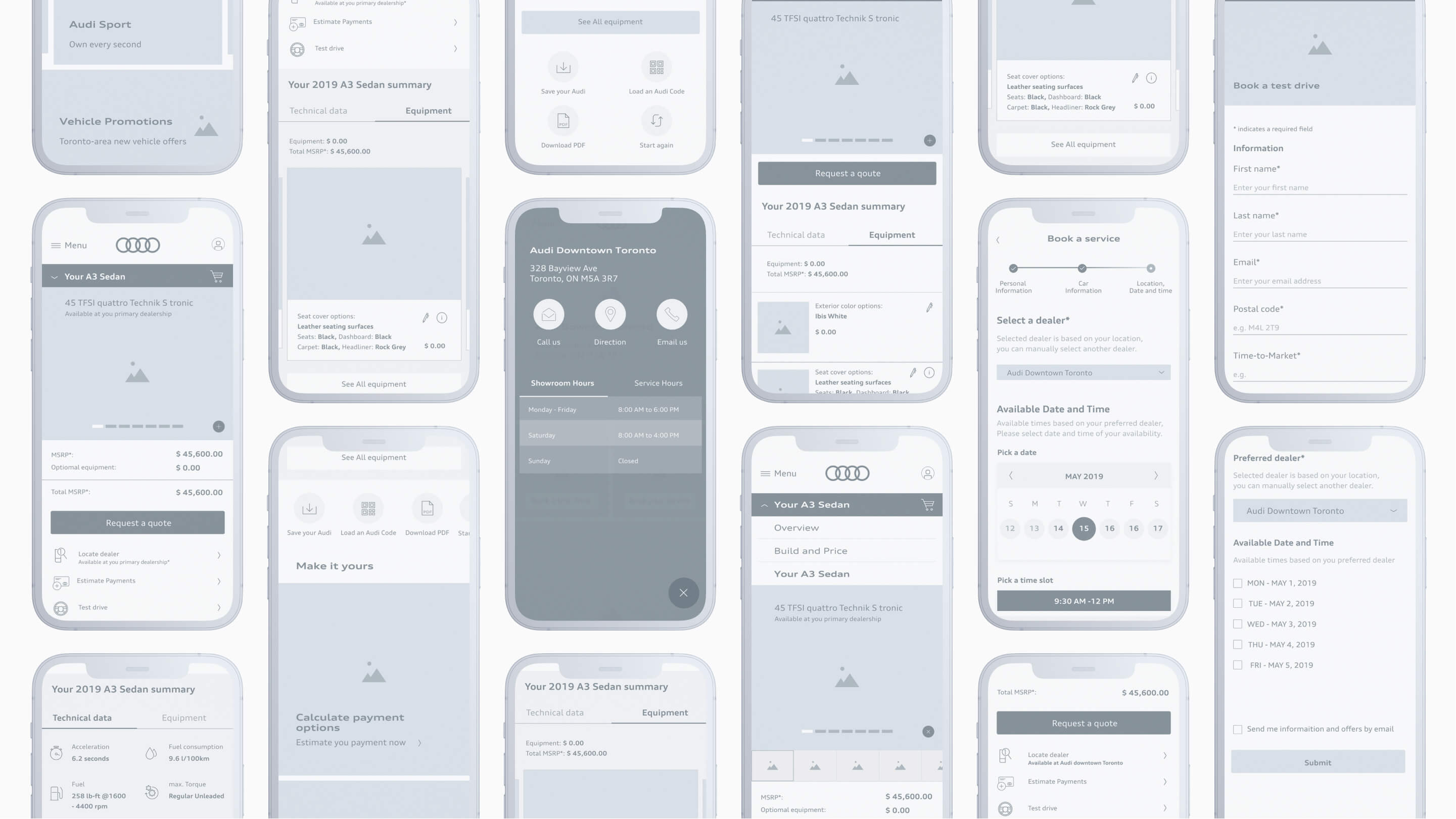
The phases and their sprints are a crucial part of the process; they allow us to work in organized blocks. Each block of time has a set goal. Within these blocks, wireframes were created and prototypes were built, and later, extensive user testing was incorporated into the process. Mobile breakpoint lead the way for design and once defined, the experience was then shaped for tablet and desktop.
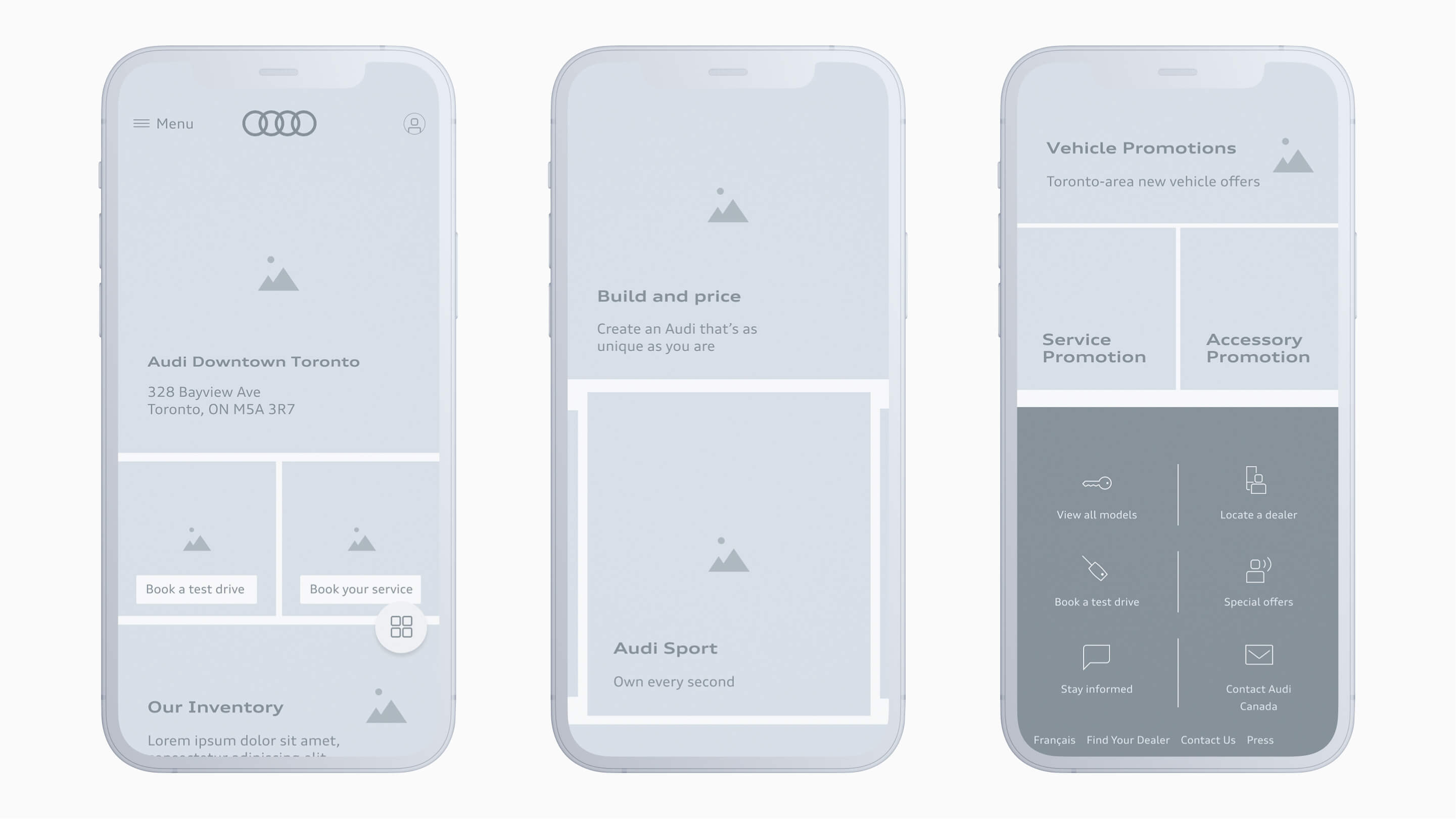
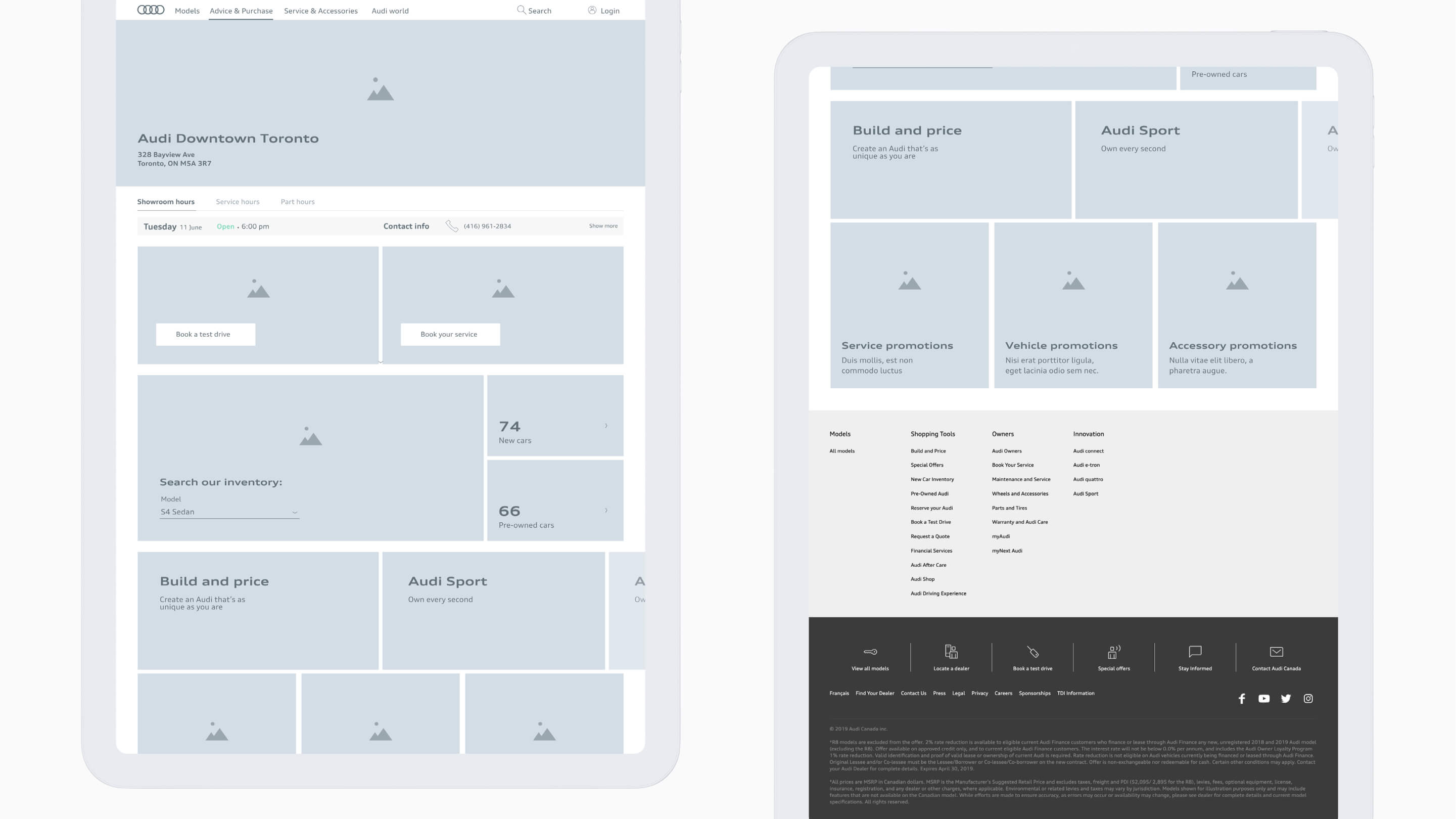
The validation of the wireframes required the approval of both the dealers and the end-users. As such, the goal was to create the perfect sweet spot between desired functionality from the dealers and a clean and easy-to-use experience. Creating scenarios that tested each epic at the wireframe stage, user tests and interviews with various dealerships to ensure their needs were met. Utilizing their feedback and analyzing their behaviours informed the following sprints as that feedback was then incorporated into the designs.
Following the interface design phase, testing scenarios were crafted to ensure that the ideal functionality for the dealers was both intuitive and approachable by design. It was ensured that each customer type experienced the designs as a safe space for decision-making - after all, a car purchase is not a throwaway purchase. It requires time and consideration. This behavioural understanding informed the way each feature was presented, through every stage of the project.
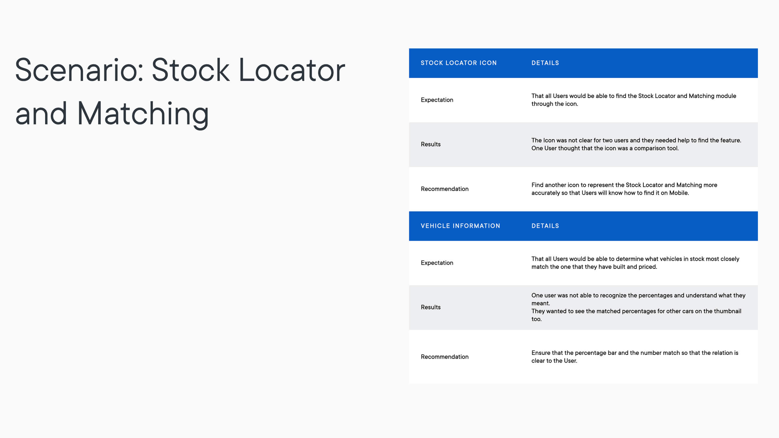
Ultimately, thoughtful UX design provided users with a positive, impactful experience, supporting the overall customer - and dealer - journey.
The Finish Line
Over the course of fifteen months, a custom process was created for Audi Canada, delivering the unified dealer experience they were looking for.
Crossing the finish line is always bittersweet; proud of what was accomplished, feelings of elation were mixed with a note of nostalgia. A year and a half - give or take - sounds like a long time, yet felt like a blur.
Working side-by-side with one of the biggest car companies in the world to revolutionize the way users experience their brand is an absolute dream project and by simplifying the experience, Audi’s definitive authority was amplified within the automotive industry.
This project was completed under my leadership at Digital Natives.


